LEADS ARE THE METRIC
“LEADS ARE THE METRIC THAT, AS MARKETERS, WE RELY ON BECAUSE LEADS MEAN MONEY.” -Kipp Bodnar Hubspot
Generating leads - both high in quantity and quality - is a marketer's most important objective. A successful lead generation engine is what keeps the funnel full of sales prospects while you sleep. Surprisingly, only 1 in 10 marketers
There can be a lot of moving parts in any lead generation campaign and often it’s difficult to know which parts need fine-tuning. In this guide, we will expose the top 30 techniques marketers should utilize to increase leads and revenue.
So what goes into a best-of-class lead generation engine? First, let's take a look at the mechanics of high performing lead generation campaigns...
THE PARTS AND PIECES OF DIGITAL LEAD GENERATION
Before you dive into the 30 tips, You must understand the mechanics of lead generation. The best lead generation campaigns contain most, if not all, of these components. From a tactical perspective, a marketer needs four crucial elements to make inbound lead generation happen. These include:
OFFER CALL-TO-ACTION LANDING PAGE FORM

An offer is a piece of content that is perceived high in value. Offers include ebooks, white papers, free consultations, coupons and product demonstrations.
A call-to-action (CTA) is either text, an image or a button that links directly to a landing page so people can find and download your offer.
A landing page, unlike normal website pages, is a specialized page that contains information about one particular offer, and a form to download that offer.
You can’t capture leads without forms. Forms will collect contact information from a visitor in exchange for an offer.
The tips cover each of these elements so that each component is fully optimized to help you generate the most leads for your business. Now it is time to get started.
Content & Offers
CREATING IRRESISTIBLE OFFERS
Yes. It’s one of the most powerful words in the human language. And if you think about all the things we do as marketers, it’s ultimately to get people to say “yes” to our offers.
When an offer is exclusive, scarce, or in high demand, it becomes more desirable. Whether they are whitepapers, free trials, memberships, sales promotions, or downloads, these irresistible elements can overcome a lead’s typical friction, doubt, or concern.
Why do these elements work? Because they trigger a physiological reaction that makes an offer more valuable. People need to perceive the value of your offer to be greater than what you’re asking for in return. The higher the perception of value, the more irresistible the offer. So how do you create irresistible offers? Glad you asked...
Use the Element of Scarcity
If you look at the principle of supply and demand, you’ll notice that when supply is limited, demand goes up. Scarcity has a psychological influence on us, making us want something even more if there isn’t enough to go around. Scarcity is great because it creates a fear of shortage, and thus a sense of urgency.
Limited Time Offers
Limited time offers are among the most popular in the scarcity category. Think about your average car dealership practically every commercial is a limited time deal. “Get 0% financing before it’s gone!”
Limited Quantity Offers
When something is of limited quantity, it suddenly becomes unique or exclusive. In some studies, limited quantity or supply offers have outperformed limited-time offers. Why? Because it’s hard to tell when an offer of limited quantity will suddenly become unavailable, while a time-based offer has a known end time. Limited quantity offers are great for not only getting people to say “yes” to your offer but to avoid procrastination completely.
Limited Time and Limited Quantity
Groupon is the perfect example of using both tactics. All Groupon deals end within a certain time frame, and they limit the number of people who can buy a Groupon. That’s a powerful combination. The site also packages these scarcity tactics with discounting, which is another great value-add, especially for e-commerce businesses.
The Bandwagon Effect
It’s a natural tendency for humans to copy one another, even without realizing it -- we like to be a part of tribes and social communities. So when we notice our social circle is doing one thing, we tend to follow suit. One great way to make an offer more valuable is to show that other people are participating in that offer.
Proof in Numbers
When possible, a great way to indicate how awesome an offer is to mention the number of people who have purchased, downloaded, signed up, or donated.
Some examples include:
Make sure your claims are not only true but believable.
- Webinars: Add the number of people who have signed up for your webinar in your social post
- Blog Subscription: You can add a lead flow or pop up on your Blog
Home page what indicates the number people who have subscribed and how to join them. Here is an example from Copyblogger
- Conferences: Think about becoming visible at Conferences and events that are relevant to your industry. Post a photo on your social media channels to let your follows know what events
your attend. It isgood way of showing that your company is active in social communities that they are a part of. Which will help turned from just follower to leads.
Leverage Video in Channel Marketing
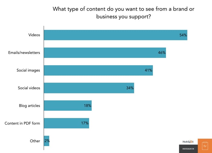
According to an upcoming report from HubSpot Research, 54% of consumers want to see videos from brands they support in comparison to email newsletters (46%) or social image (41%) based content. They also found that video content was the most memorable (43%) in comparison to text (18%) and images(36%).
Video can be used not only for SEO purposes, but it can also be across channels for lead generations such as social media, on your website and in email marketing. You can use it in all stages of the buying process, and sales funnel.
Focus on Creating An Amazing Title
Brian Halligan, HubSpot CEO and co-founder, once said that “you can have a great offer with a bad title and no one will download it. But if you have an amazing title, suddenly everyone wants it.” Yes - people do judge a book by it’s cover. If your offer is a piece of content, such as a whitepaper, ebook, or presentation, put effort into creating an amazing title.

For an experiment, Hubspot changed the title of an ebook and ran an A/B test to see which one would perform better. They took the original title “The Productivity Handbook for Busy Marketers” and changed it to “7 Apps That Will Change the Way You Do Marketing.”
As you can see, the revised version outperformed the original by 776% at generating leads (first-time submissions). Not only that, but it resulted in more customers as well. If you’re struggling to come up with the perfect headline, try using the Headline Analyzer Tool by Advanced Marketing Institute.
Create Offers For Different Buying Stages
The most common offer I see on most websites is “Contact Us.” Sure, you want all your prospects to talk

Someone at the top of the buying cycle may be more interested in an informational piece like a guide or ebook, whereas someone more committed at the bottom of the cycle might be more interested in a free trial or demo. You don’t need to pick and choose; create offers for each phase, and include a primary and secondary CTA to these offers on various pages throughout your site.
Avoid Corporate Gobbledygook
A professional image is necessary but you still want to avoid the dreaded corporate gobbledygook. What is gobbledygook you ask? Great question.
These are jargon terms and phrases that have been over-used and abused rendering them meaningless (you’ll find them mostly in the high-tech industry, but everyone is an offender at one point or another). These words are meant to add more emphasis on a particular subject, but instead, they make your eyes roll.
Avoid these words when describing your offer.
To learn more, download The Gobbledygook Manifesto ebook by David Meerman Scott
Use High-Value Offer Formats
Not all offers are created equal. Some “formats” of offers perform better than others at converting leads. For example, what’s more valuable, a whitepaper or an ebook?
Below are the type of offers, in order of performance, that generate the most amount of leads.
It’s important to test different types of offers with your audience to determine what works for you. While ebooks score high on our list, you may find that reports, videos or other formats do better.
Table of Contents
CHAPTER 1: CONTENT AND OFFERS
CREATING IRRESISTIBLE OFFERS
Yes. It’s one of the most powerful words in the human language. And if you think about all the things we do as marketers, it’s ultimately to get people to say “yes” to our offers.
When an offer is exclusive, scarce, or in high demand, it becomes more desirable. Whether they are whitepapers, free trials, memberships, sales promotions, or downloads, these irresistible elements can overcome a lead’s typical friction, doubt, or concern.
Why do these elements work? Because they trigger a physiological reaction that makes an offer more valuable. People need to perceive the value of your offer to be greater than what you’re asking for in return. The higher the perception of value, the more irresistible the offer. So how do you create irresistible offers? Glad you asked...
#1
Use the Element of Scarcity
If you look at the principle of supply and demand, you’ll notice that when supply is limited, demand goes up. Scarcity has a psychological influence on us, making us want something even more if there isn’t enough to go around. Scarcity is great because it creates a fear of shortage, and thus a sense of urgency.
Limited Time Offers
Limited time offers are among the most popular in the scarcity category. Think about your average car dealership practically every commercial is a limited time deal. “Get 0% financing before it’s gone!”
Limited Quantity Offers
When something is of limited quantity, it suddenly becomes unique or exclusive. In some studies, limited quantity or supply offers have outperformed limited-time offers. Why? Because it’s hard to tell when an offer of limited quantity will suddenly become unavailable, while a time-based offer has a known end time. Limited quantity offers are great for not only getting people to say “yes” to your offer but to avoid procrastination completely.
Limited Time and Limited Quantity
Groupon is the perfect example of using both tactics. All Groupon deals end within a certain time frame, and they limit the number of people who can buy a Groupon. That’s a powerful combination. The site also packages these scarcity tactics with discounting, which is another great value-add, especially for e-commerce businesses.
#2
The Bandwagon Effect
It’s a natural tendency for humans to copy one another, even without realizing it -- we like to be a part of tribes and social communities. So when we notice our social circle is doing one thing, we tend to follow suit. One great way to make an offer more valuable is to show that other people are participating in that offer.
Proof in Numbers
When possible, a great way to indicate how awesome an offer is to mention the number of people who have purchased, downloaded, signed up, or donated.
Some examples include:
Make sure your claims are not only true but believable.
- Webinars: Add the number of people who have signed up for your webinar in your social post
- Blog Subscription: You can add a lead flow or pop up on your Blog
Home page what indicates the number people who have subscribed and how to join them. Here is an example from Copyblogger
- Conferences: Think about becoming visible at Conferences and events that are relevant to your industry. Post a photo on your social media channels to let your follows know what events
your attend. It isgood way of showing that your company is active in social communities that they are a part of. Which will help turned from just follower to leads.
Leverage Video in Channel Marketing
According to an upcoming report from HubSpot Research, 54% of consumers want to see videos from brands they support in comparison to email newsletters (46%) or social image (41%) based content. They also found that video content was the most memorable (43%) in comparison to text (18%) and images(36%).
Video can be used not only for SEO purposes, but it can also be across channels for lead generations such as social media, on your website and in email marketing. You can use it in all stages of the buying process, and sales funnel.
#4
Focus on Creating An Amazing Title
Brian Halligan, HubSpot CEO and co-founder, once said that “you can have a great offer with a bad title and no one will download it. But if you have an amazing title, suddenly everyone wants it.” Yes - people do judge a book by it’s cover. If your offer is a piece of content, such as a whitepaper, ebook, or presentation, put effort into creating an amazing title.

For an experiment, Hubspot changed the title of an ebook and ran an A/B test to see which one would perform better. They took the original title “The Productivity Handbook for Busy Marketers” and changed it to “7 Apps That Will Change the Way You Do Marketing.”
As you can see, the revised version outperformed the original by 776% at generating leads (first-time submissions). Not only that, but it resulted in more customers as well. If you’re struggling to come up with the perfect headline, try using the Headline Analyzer Tool by Advanced Marketing Institute.
#5
Create Offers For Different Buying Stages
The most common offer I see on most websites is “Contact Us.” Sure, you want all your prospects to talk

Someone at the top of the buying cycle may be more interested in an informational piece like a guide or ebook, whereas someone more committed at the bottom of the cycle might be more interested in a free trial or demo. You don’t need to pick and choose; create offers for each phase, and include a primary and secondary CTA to these offers on various pages throughout your site.
#6
Avoid Corporate Gobbledygook
A professional image is necessary but you still want to avoid the dreaded corporate gobbledygook. What is gobbledygook you ask? Great question.
These are jargon terms and phrases that have been over-used and abused rendering them meaningless (you’ll find them mostly in the high-tech industry, but everyone is an offender at one point or another). These words are meant to add more emphasis on a particular subject, but instead, they make your eyes roll.
Avoid these words when describing your offer.
To learn more, download The Gobbledygook Manifesto ebook by David Meerman Scott
#7
Use High-Value Offer Formats
Not all offers are created equal. Some “formats” of offers perform better than others at converting leads. For example, what’s more valuable, a whitepaper or an ebook?
Below are the type of offers, in order of performance, that generate the most amount of leads.
It’s important to test different types of offers with your audience to determine what works for you. While ebooks score high on our list, you may find that reports, videos or other formats do better.
CHAPTER 2: CALLS-TO-ACTION THAT ROCK
Calls-to-action (CTA) are the secret sauce to driving people to your offers.
If your CTAs aren’t effective at capturing people’s attention and persuading them to the click, then it makes the offer useless.
CTAs can be used on product pages (non-landing pages), in display ads, email, social media, direct mail and pretty much anywhere you can market your offer.
But not all CTAs are created equal. In a world where every brand is fighting for consumers attention, it’s critical that prospects choose your offer over your competitors. In this guide, we’ll uncover tips for creating CTAs that rock.
#8
Place Your CTA Where the Eye Can See
Calls-to-action does best “above the fold” - the space where your web page is viewable to the user without having to scroll down. According to heat map analysis, anything “below the fold” will only be viewed by 50% of people who visit your page. Doubling impressions on your CTAs can significantly increase your lead count.

#9
Clarity Trumps Persuasion
That is one of my favorite phrases I learned from the folks at Marketing Experiments. Often, marketers will put more focus on being clever than clear. Be crystal clear about what offer is in your CTA. And be specific. If you’re giving away a free guide, say “Download our FREE guide to X.” If you’re hosting a free webinar, say “Register for our FREE webinar on X.” X should clearly convey a compelling benefit of receiving the offer. This is much more effective
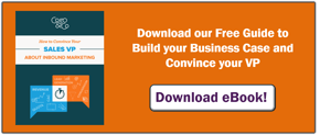
than “Download Now” or “Get a Free Article.” These simply aren’t specific enough.
Notice that this CTA is to promote an ebook. There is little copy
#10
Use Contrast to Make CTAs Stand Out
A call-to-action is meant to stand out, so if your CTA blends in too much with your site design, no one will notice it. You want as many eyeballs to land on that call-to-action as possible, so use contrasting colors to make the CTA stand out, and more importantly, use design to make it clear it is a clickable call-to-action
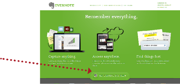
It would be worth testing to see that if a different color - such as blue, red, or orange - would result in more clicks.
#11
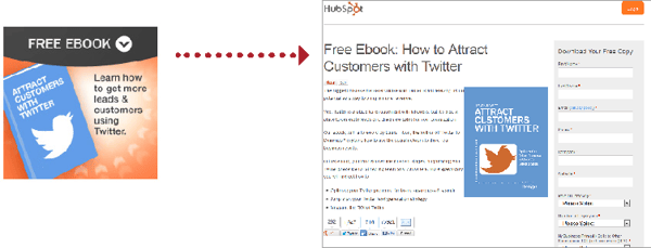
Link Your CTA to a Dedicated Landing Page
This tip might seem minor, but it’s incredible how often businesses miss this opportunity. Calls-to-action are meant to send visitors to a de
This CTA for a Twitter ebook drives visitors directly to a landing page for that ebook
If you have the opportunity to use a CTA, send them to a page that will convert them into a lead.
#12
Promote Offers on Product Pages
CTAs shouldn’t be one size fits all. If your company offers various products or services, you may want to consider creating a different offer for each of them. Then you can place CTAs linking to each offer on the website pages that are most relevant to that offer.
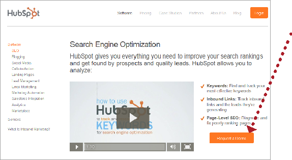
In this example, a CTA for “Request a Demo” is placed on a product page. To generate more leads, Hubspot might also have a CTA for a “Free Guide to SEO,” because it is related to the product offering.
#13
Thank You Pages are Great CTA Real Estate
Even if someone completes a form on your website (thus
Once someone reaches a “thank you page,” the page that a visitor arrives on after completing a form, use that space as an opportunity to promote more offers and content. For example, if a visitor on cogostrategy.com downloads a guide on convincing your Sales VP to choose inbound marketing 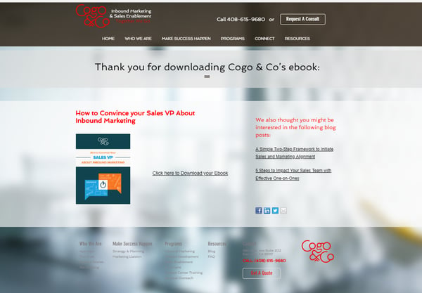
CHAPTER 3: LANDING PAGES THAT CONVERT
Landing pages are one of the most important elements of lead generation.
In fact, according to MarketingSherpa’s research, landing pages are effective for 94% of B2B and B2C companies. The use of landing pages enables marketers to direct website visitors to targeted pages and capture leads at a much higher rate.
What’s great about landing pages is that they direct your visitors to one particular offer without the distractions of everything else on your website. Visitors are on a landing page for one and only purpose: to complete the lead capture form.
#14
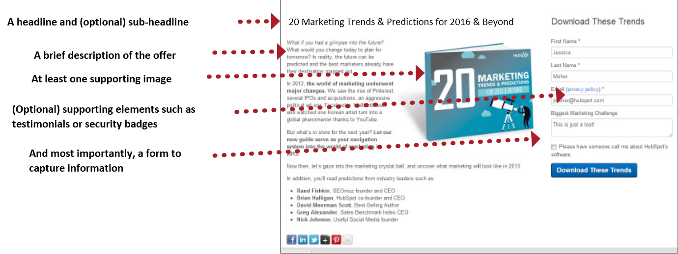
Elements of an Effective Landing Page
Landing
#15
Remove the Main Navigation
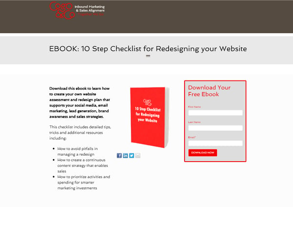
Once a visitor arrives on a landing page, it’s your job to keep them there. If there are links on the page to move about your website, it will distract the visitor and decrease the chance of them converting on the page.
One of the best ways to increase your landing page conversion rates is to simply remove the main navigation from the page. That’s it!
#16
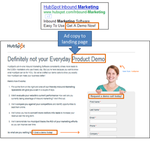
Match the Headline of the Landing Page to the Corresponding CTA
Keep your messaging consistent on both your CTA and the headline of the landing page. If people click on a link for a free offer and then find out there’s a catch on the landing page, you’ll instantly lose their trust. Similarly, if the headline reads differently than the CTA, it might lead to confusion, and the visitor might wonder if the CTA is linked to the wrong page.
#17
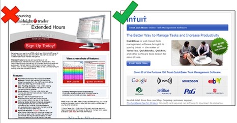
Less is More
I’m sure you’re aware of the rule “keep it simple, stupid.” The same applies to landing pages. A cluttered page means a distracted visitor. Be brief and to the point; it’s in the offer itself where you give more information. In addition to your headline, include a brief paragraph explaining what the offer is, followed by a few bullet points outlining the benefits of the offer.
#18
Emphasize the Benefits of the Offer
Make it clear in your brief paragraph and/or bullet points what the benefits of the offer are. It’s more than just listing what the offer is comprised of; it takes a bit of spin. Instead of “Includes specifications of product XYZ,” say something like “Find out how XYZ can increase productivity by 50%.” In other words, convey the value of your offer clearly and effectively.
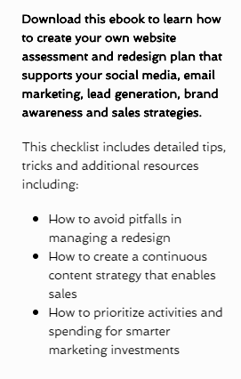
The landing page copy tells the visitor what they will receive when downloading the offer.
#19
Encourage Social Sharing
On your landing page, don’t forget to include buttons to enable your prospects to share content and offers. Include multiple social media channels as well as email, since people have different sharing preferences. When your offer is shared more, more people land on the page, and therefore more people fill out your form and become leads!
#20
More Landing Pages Equal More Leads
According to a marketing benchmarks report, companies see a 55% increase in leads by increasing landing pages from 10 to 15. The more content, offers, and landing pages you create, more opportunities to generate more leads for your business.

CHAPTER 4: OPTIMIZED FORMS
Forms are the key to a landing page.
Without them, there is no way to “convert” a visitor into a lead. Forms come in handy when it’s time for people to sign-up, subscribe to your site or download an offer.
The following tips will uncover how to build great landing page forms.
#21
The Right Form Length
You might be wondering how much or how little information you should require using a form. There is no magic answer when it comes to how many fields your form should contain but the best balance would be to collect only the information you really need. Keep in mind that each visitor on your landing pages will be considering whether the perceived value
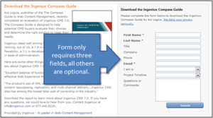 The fewer fields you have in a form, the more likely you will receive conversions. This is because with each new field you add to a form, it creates friction (more work for the visitor) and fewer conversions. A longer form looks like more work and sometimes it will be avoided altogether. But on the other hand, the more fields you require, the better quality those leads might be. The best way to determine what works best is to test it.
#22
To Submit or Not to Submit
That is the question most of your visitors are asking. One of the best ways to increase form conversion rates is to simply NOT use default word on your button: “SUBMIT.”
If you think about it, no one wants to “submit” to anything. Instead, turn the statement into a benefit that relates to what they are getting in return.
For example, if the form is to download a brochure kit, the submit button should say, “Get Your Brochure Kit.” Other examples include “Download whitepaper,” “Get your free ebook,” or “Join our Newsletter.”
Another helpful tip, make the button big, bold and colorful. Make sure it looks like a button (usually beveled and appears “clickable”).
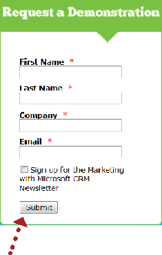
Don’t do this!
#23
Reduce Anxiety With Proof-Elements
People are more resistant to give up their information these days, especially because of the increase in spam. There are a few different elements you can add to the form or landing page to help reduce a visitor’s anxiety to complete the form:
- Add a privacy message (or link to your privacy policy) that indicates their email will not be shared or sold.
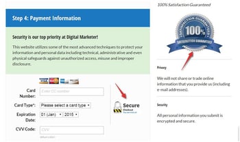
- If your form requires sensitive information, include security seals, a BBB rating, or certifications so that visitors know their information is safe and secure.
- Adding testimonials or customer logos is another great to indicate social proof. For example, if your offer was for a Free Trial, you may want to include a few customer testimonials about your product or service.
#24
Make the Form Appear Shorter
Sometimes people won’t fill out a form just because it “looks” long and time-consuming. If your form requires a lot of fields, try making the form look shorter by adjusting the styling.
For example, reduce the spacing in between fields or align the titles to the left of each field instead of above it so that the form appears shorter. If the form covers less space on the page, it may seem as if you’re asking for less.
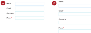
Both forms have the same amount of fields, but version A might look shorter than B on the page.
CHAPTER 5: MULTI-CHANNEL LEAD GENERATION
Your website isn’t a silo.
Marketers must utilize many other channels in order to maximize their lead generation efforts. In this sense, a channel might be an inbound call center, a website, a social media platform, an email, or a text message. The objective is to make it easy for buyers to research, evaluate and purchase products in any way that is most appropriate for them. It’s all about having the right marketing mix.
In this last chapter, we will briefly cover a few channels that help businesses generate the most amount of leads.
#25
Blogging Brings in the Leads
According to HubSpot’s recent Benchmarks report, companies that blog 6-8 times per month double their lead volume. This proves that blogging is a highly effective channel for lead generation.
In every blog post, include hyperlinks to landing pages within the copy of the post, as well as a prominent call-to-action.
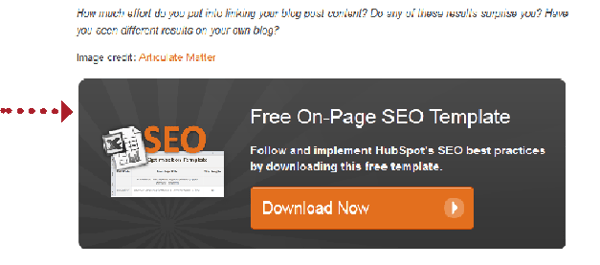
An example of a CTA at the bottom of a HubSpot blog post. The offer matches the content of the post for relevance.
#26
Email Marketing
Many businesses may think that email marketing is only best used when communicating with existing prospects and customers. Not so! Email can be a great channel for
- Focus on an opt-in strategy. If you’re buying email lists and spamming your prospects, no one will want to share your email with others. They will only want to unsubscribe! The first step to email lead generation is to make sure you have happy subscribers that enjoy receiving emails from you.
- Send people valuable offers. If you send really interesting or valued offers - whether it’s downloads, discounts or educational content - people will more likely share your emails with their friends or colleagues.
- Give people the tools to share. Don’t forget to add a “Forward to a Friend” link or social media sharing buttons within each email so people are encouraged to pass it on.
Simple email promoting a valuable offer that includes social media sharing buttons.
#27
Social Media
Social media isn’t just for liking funny pictures or tweeting what you ate for breakfast. Social media is an emerging channel that many businesses are taking advantage of. Here are some great tips for generating leads on social networks.
- Build a loyal following. Building a relationship with potential customers is a critical first step. Social media connections are really about people-to-people, not always company-to-individual. Get to know your audience online, communicate and share information. In order to generate leads, you need to have human interaction with others.
- Remember, social media is a dialogue. Companies that only use social media to blast out messages about themselves aren’t using social channels effectively. The goal is to interact with others and be helpful. When you share content on social media, don’t always post something that relates to your company. Share links to other interesting things you’ve found online. People will be very thankful you are noticing their work, too!
- Influence connections for content sharing. Publishing and sharing content that directs traffic to targeted landing pages is the single biggest lever to increase lead generation through social media. Share your new content offers by posting links to landing pages, and in addition, share blog posts, discounts, and other great resources.
#28
Stay Up to Date with Organic Search
Keep in mind that Search Engines are always evolving. What worked for Search Engine Optimization of your web pages and lead generation efforts last year may not work as effectively today.
Get your Content Strategy for organic search up to date by following these easy steps which are also further explained in the video below:
Step 1: Decide on a core topic (short word and terms) to write about that your business is an expert on and is associated
Step 2: Create a list of subtopics (long-tail keywords) that support your core topics. Have at least 5 subtopics for each core topic.
Step 3: Utilize these subtopics (long-tail keywords) as subject matter for blogs, each of which promotes your offer
Step 4: Add the core topic
Step 5: Track and Measure your Success. You can track your success by using a number of tools such Google Analytics, Hubspot, or Creating your own dashboard in Excel, Google sheet or Google data studio.
#29
Use Links and CTAs within Offers
Your offers themselves are great channels for lead generation. For example, this ebook includes links to other content offers you can download. As people share this ebook they may discover other resources that are offered by the links within the content.
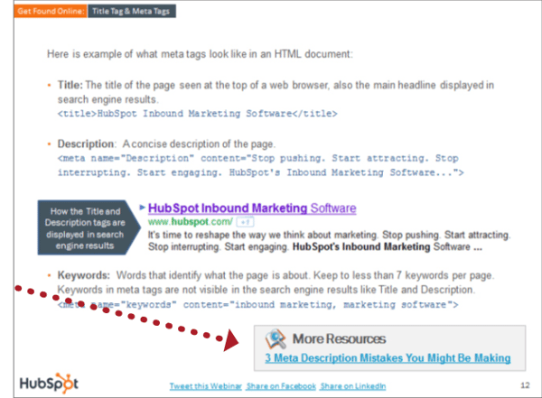
Within this ebook “25 Website Must-Haves,” are links to other ebooks and guides.
#30
A/B Testing
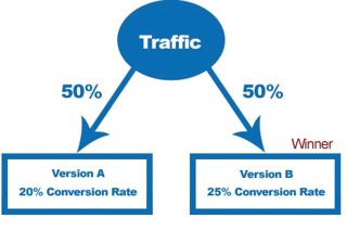
While this isn’t a channel per say, it is a great way to increase leads across all channels and tactics. A/B testing can be used in calls-to-action, landing pages, email marketing, advertising, and more. According to HubSpot research, A/B testing your landing pages and other assets can help you generate up to 40% more leads for your business. When done correctly, A/B testing can provide a huge competitive advantage for your company.
Time To Start Generating Leads
The basics herein are just the beginning. This guide contains many best practices for every aspects of lead generation to help bolster your conversion rates, but these tactics are only the tip of the iceberg. Continue to tweak, test, and measure each step of your inbound lead generation process in an effort to improve lead quality and increase revenue.
Additionally, you can fill out this form to schedule a FREE 30 minute consultation with one of our experts to discuss how to apply these tips to your new campaign or existing website.
Schedule a Consultation
Contributors:

Anthony Grower
Topic Specialist

Kelly Brighton
Topic Specialist

Richard Peace
Topic Specialist
Sources:
From Our Blog
Stay up to date with what is new in our industry, learn more about the upcoming products and events.


